The context
A firm that sells branding, websites and paid acquisition starts with a handicap no pitch can make up for: it is judged on its own shop window before it is judged on its work. A slow site, a vague identity, an empty blog, and the demonstration is over before the first conversation.
There is a further difficulty specific to consulting. We sell judgement, not a product you can try before buying. A prospect cannot test the quality of a diagnosis; they can only judge it by what they read before speaking to us. The shop window is therefore not a shop window: it is the sample.
So we treated MAstratos the way we treat a client. Same method, same standards, same trade-offs. The difference is that here everything can be checked: you are standing on the deliverable.
What we did
Branding
Positioning, brand platform, identity. The firm had to say what it does without borrowing the vocabulary of agencies, who all promise performance and tailored support.
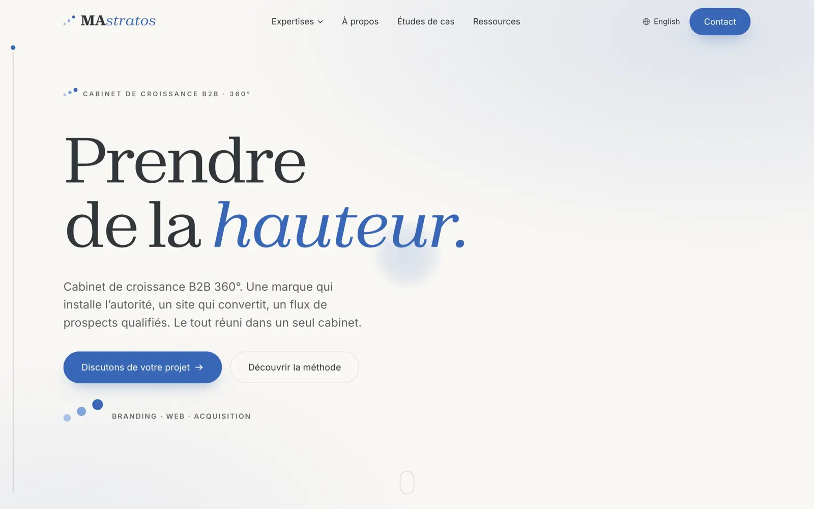
The positioning we settled on holds one idea: gain altitude before executing, then hold the whole chain from the brand to the click. The identity translates that idea literally. Three dots climbing diagonally, from small and pale to large and dense, act as a signature and reappear everywhere, at the head of a section as in the logo itself. The gradients follow the same order of altitude, always ascending. An editorial serif carries the headings, a neutral sans the body text, on a cream background that refuses the usual agency white. Nothing is decorative: every mark repeats the same word.
Web
A static, bilingual site with no technical debt: French at the root, English
under its own prefix, with translated addresses rather than copied ones.
/agence-branding/ becomes /en/branding/, not a carbon copy of the
French slug.
That choice has a consequence you have to own: two versions whose addresses cannot be derived from one another can no longer be paired by a simple prefix. The two versions are therefore linked through a single table, which serves the language tags, the language switcher and the sitemap alike. Reciprocity becomes true by construction, which is no small matter: Google ignores a non-reciprocal set of language tags outright, and that is the classic trap of multilingual sites. It is a detail no reader will ever notice, and exactly the kind of detail that decides whether a bilingual site ranks or is ignored.
The rest follows the same logic: a hundred and eighty-five pages built ahead of time, no database queried while the visitor waits, a deployment replayed on every commit.
Content
A hundred and thirty-six pieces of analysis, a hundred and thirteen in French and twenty-three in English. The English articles are not translations: subjects and angles are chosen for their own market.
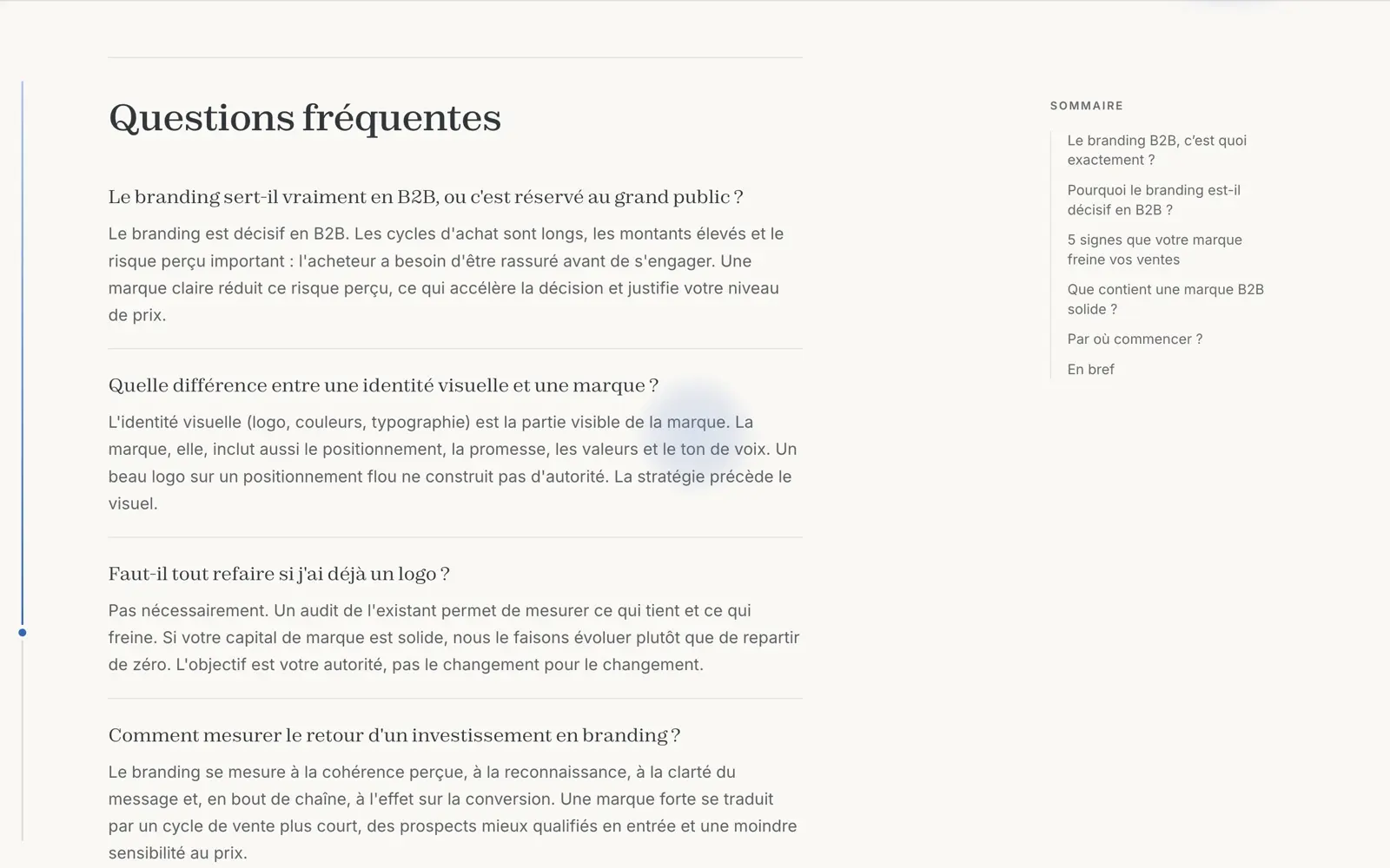
Every article is built to answer, not to fill a slot. All hundred and thirteen French articles carry a marked-up FAQ at the end. Ninety-two carry an original dataset, meaning an aggregation, a comparison or a verification we carried out ourselves and declared as such to search engines: that is what separates proper analysis from a rehash of third-party sources, and the main reason a generative engine cites anyone. Two hundred and eighty-three diagrams were drawn by hand, in vector form, each with a long description for screen readers.
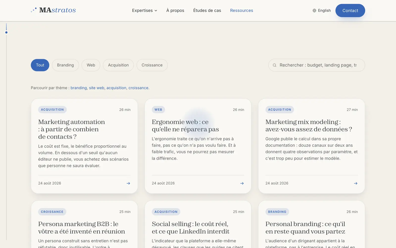
Alongside them, fifty-one downloadable templates, workbooks and working documents that turn a read into something usable the next morning.
Measurement
A website that measures nothing never improves. We installed the full chain: audience measurement and session recording, conversions tied to the forms, and an automatic hand-off to the CRM carrying the origin of the visit. From the first page read to the prospect record, with no manual entry in between.
The calls that mattered
Translating the addresses rather than copying them. More expensive to maintain, and the only way to give the English version a chance. The cost is real: it meant building the pairing table and a checker that fails the build if an English page is missing from it.
Refusing filler articles. Analysis with no data of its own and no verifiable source is indistinguishable from what any generator produces. The internal rule is simple: no figure without a linked primary source, and no secondary source when the primary one is reachable.
Making the diagrams accessible. Two hundred and eighty-three diagrams, each with a short title and a long description. Invisible work for most readers, and the condition for the rest of it to be visible at all.
Measuring before optimising. The measurement chain was laid before the first campaign, not after. That is what makes comparison possible today; doing it the other way round means starting from zero.
The result
Three Lighthouse audits at 100 out of 100 in mobile profile, fifty-seven checks passed without a single failure, a server answering in 72 milliseconds, no visual shift on load.
None of this has to be taken on trust. Open your browser’s developer tools, run the audit on this page, compare. That is the whole principle of this case study: the only argument worth making is the one the other side can verify without us.