The context
MA Utility publishes a customer conversation platform. Every messaging channel a company uses, WhatsApp, Instagram, Telegram, email, website chat, lands in a single inbox where an AI answers, qualifies and books meetings in place of a human who is not available at ten on a Saturday evening. The audience is the small and mid-sized company, the one losing customers for being slow to reply, not the one running a fifteen-person support desk.
The product was solid. The problem sat elsewhere, and it is a familiar one in this market: software that talks to non-technical buyers has to be understood in seconds, in a field where every competitor promises the same thing in the same words. Add a buyer who has never heard of the brand and is asked to hand over their customer conversations to an unknown vendor, and the real subject appears: credibility comes before features.
The whole chain had to hold, from the brand to the website through to acquisition. That is exactly what the MAstratos single point of contact offers, and this case is its testing ground. This is a project run inside the MA ecosystem, on a related company rather than a third-party client: we applied the method to ourselves before offering it anywhere else.
What we did
Branding
We built the brand from a blank page: positioning in the market, brand platform, then visual identity and guidelines.
The positioning moved along the way, and that correction matters more than any logo. The original promise, “automate your customer service and sales on WhatsApp”, locked the product into one channel and two use cases, while the platform already covered the whole customer relationship across every messaging app. The message became the centralisation of conversations, whatever the channel. A positioning that is too narrow cannot be fixed with advertising: it caps the addressable market from the first line of the website onwards.
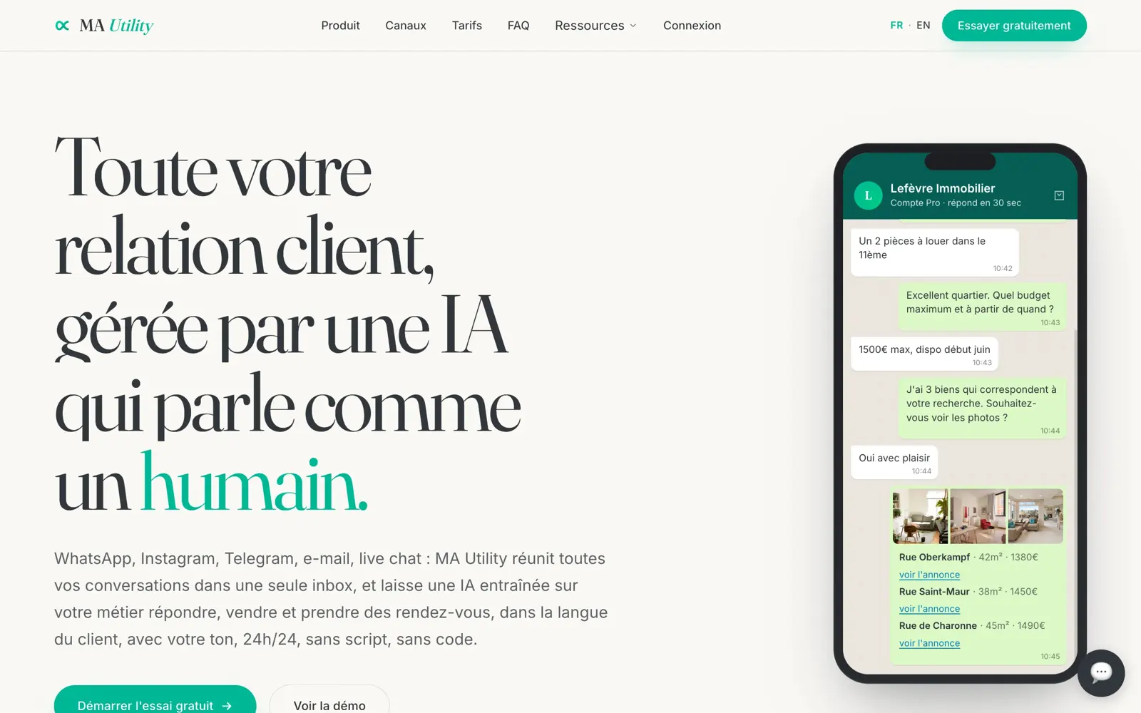
The identity rests on one contrast, held everywhere: a serif with real character for headings, a neutral sans for body text, a cream background rather than the clinical white of software, and a single accent, a strong blue-green. That green is not decorative: it marks only what belongs to the brand, never the conversation screenshots, whose bubbles keep the colours of the messaging app they come from. The reader can tell at a glance what MA Utility says from what the product does.
Web
The site is bilingual by birth, French at the root and English under its own prefix, with reciprocal language tags and a declared default version. Nineteen pages per language, thirty-eight in total: the shop window, documentation including an API reference and an inbox guide, a blog, a customer case page, press, careers, and the full set of legal pages.
Those legal pages are not filler. When a product connects to WhatsApp, Meta makes app approval conditional on specific pages existing, including a publicly accessible data deletion page. They were treated as deliverables in their own right, because a single missing one blocks the product itself from going live.
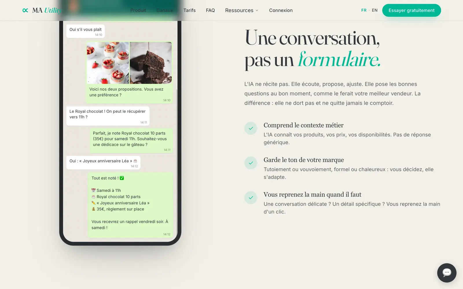
The editorial stance fits in a sentence: show the product doing the work. Instead of a feature list, every section carries a complete conversation set in a recognisable trade, an estate agency or a pâtisserie, right through to the confirmed order. The visitor understands the product without being told, and pictures it in their own business.
Two calls to action coexist without competing: the free trial for those who want to try alone, the demo for those who want to be walked through it. The second exists because this audience includes many owner-managers who will not install a messaging tool without talking to someone first. Forcing everyone down the same funnel would have cost half the enquiries.
Structurally, the site declares an organisation and a set of frequently asked questions in a format search engines read, which makes it eligible for rich results and, now, for citation by generative engines.
Paid acquisition
With the site in place, we installed the engine: audience measurement and session recording, server-side conversions, Meta and Google campaigns, dedicated landing pages per segment, and reporting on cost per qualified lead rather than per click.
Everything hinges on what you optimise for. A campaign steered on clicks optimises for clicks, and clicks can be bought in volume by anyone. A campaign steered on qualified leads learns to find the people who will actually open an account, which requires the qualification signal to travel back to the ad platform. That is plumbing work: invisible, and decisive.
The calls that mattered
Widening the promise before spending the first euro. Fixing a positioning that is too narrow costs a week of work. Leaving it in place costs a share of the addressable market on every campaign, indefinitely.
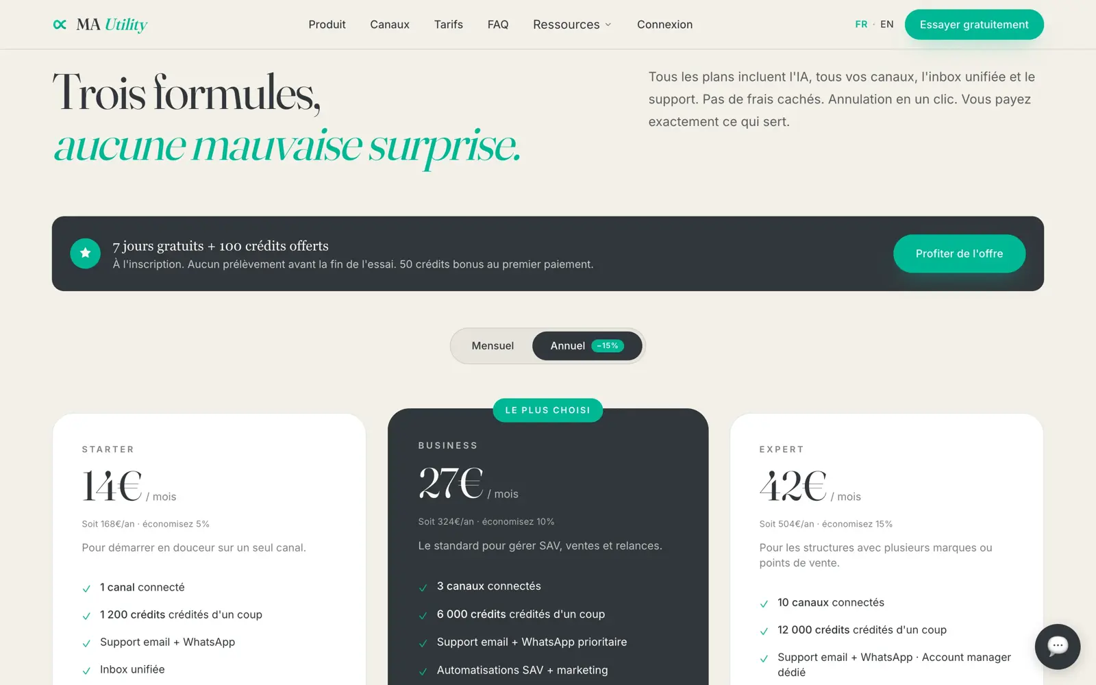
Showing the prices. Most competitors in this market send you to a form. Publishing a readable grid loses the merely curious and saves everyone else’s time: the prospect who books a meeting already knows what they are getting into.
Treating legal pages as deliverables. They convert nobody, and they determine whether the product may exist on its main channel at all.
Steering on qualified leads. Slower to set up, less flattering on a dashboard, and the only way to stop an ad platform optimising towards the wrong target.
The result
Today the brand, the website and acquisition all pull in the same direction, with a single point of contact steering the whole thing.
The campaigns run at 38 € per qualified lead, and the landing pages convert at 4.8%, above the 2 to 3% commonly seen in B2B. Above all, a new page variant goes live in under 24 hours: when the brand, the website and the campaigns are held by the same firm, there is nobody to wait for. That is where the single point of contact pays for itself.
The technical base can be checked without us. Measured on 26 August 2026 in mobile profile, the site scores 100 out of 100 for technical SEO, 100 out of 100 for best practices and 97 out of 100 for accessibility, with a single item left to fix, an insufficient contrast on one element. The server answers in 24 milliseconds. Open your browser’s developer tools on mautility.com and run the measurement again: that is the point of a verifiable number.